Website Links

Tuesday, 9 September 2014

Overview of Layouts for WPF

Layout Containers

Layout containers are what you put your content in. There are 5 main types and each have situations where they are advantageous.

Stack Panel

This is one of the most simple layouts to use, but does not give you much control over how elements are laid out. It allows you to layout items horizontally or vertically by setting the 'Orientation' attribute of the StackPanel. By default, orientation is Vertical. Its children are laid out in the order in which they are specified in the xaml and sizing is handled automatically. Here's an example:

   <StackPanel Orientation="Horizontal">            
      <TextBlock>Name</TextBlock>
      <TextBox Width="200" />
   </StackPanel>


Wrap Panel

The WrapPanel is very similar to the StackPanel, it will lay its children out either vertically or horizontally but when it runs out of space to do so it will continue to lay out its children on the next column or row respectively. It is also a simple layout to use and is advantageous when you want your layout to adjust to resizing and you aren't concerned about the positioning of your elements relative to the frame of the WPF application. Here's an example:

   <WrapPanel Orientation="Horizontal">            
      <Button>Buttons will wrap!</TextBlock>
      <Button>Buttons will wrap!</TextBlock>
      <Button>Buttons will wrap!</TextBlock>
      <Button>Buttons will wrap!</TextBlock>
      <Button>Buttons will wrap!</TextBlock>
      <Button>Buttons will wrap!</TextBlock>
      <Button>Buttons will wrap!</TextBlock>
      <Button>Buttons will wrap!</TextBlock>
      <Button>Buttons will wrap!</TextBlock>
   </WrapPanel>


Grid

This is the layout that is most frequently used throughout our Spelling Bee app, and is quite powerful while still being simple to use. When using a Grid layout you are able to specify the rows and columns, and you are also able to specify the height or width of these. We have found that we most commonly set these to either '*' or 'Auto'. Auto means that the row or column will size itself such that it fits its child, whereas * means that the remaining space will be consumed. If there are multiple rows or columns set to *, then the remaining space will be divided evenly amongst them. The * may also be prefixed by a number which will result in the corresponding column having a width: ([remaining space]/[n + other column * total]) * n, where n is the number prefixing the *. The same applies for rows, here is an example:

   <Grid>
      <Grid.RowDefinitions>
         <RowDefinition Height="Auto" />
         <RowDefinition Height="*" />
         <RowDefinition Height="3*" />
      </Grid.RowDefinitions>
      <Grid.ColumnDefinitions>
         <ColumnDefinition Width="Auto" />
         <ColumnDefinition Width="*" />
      </Grid.ColumnDefinitions>

      <TextBlock Grid.ColumnSpan="2">My Form!</TextBlock>
      <TextBlock Grid.Row="1" Grid.Column="0">Name</TextBlock>
      <TextBox Grid.Row="1" Grid.Column="1" 
         HorizontalAlignment="Stretch" />

      <TextBlock Grid.Row="2" Grid.Column="0">Comment</TextBlock>
      <TextBox Grid.Row="2" Grid.Column="1"
         HorizontalAlignment="Stretch" 
         VerticalAlignment="Stretch" 
         TextWrapping="Wrap" />
   </Grid>

In the above example, the 3rd row will take up 3/4 of the remaining space. Additionally, we specified which row and column elements would be in using Grid.Row and Grid.Column! Finally, another feature of a grid is that we can set a column or row span using Grid.ColumnSpan or Grid.RowSpan respectively. Grids are useful in many situations, but are particularly useful for laying out forms. It is important to note that you can programmatically define new rows and columns which may be useful for laying out data, but there are other elements which may make this easier.

Dock Panel

The DockPanel is one of the layouts we use less frequently, due to our unfamiliarity with it. However, it can be useful, specifically when you want some elements relative to the edges and then an element to take up the remaining central space. For example, many websites such as Facebook have a top bar, this would be set in a DockPanel by listing the top bar element first and setting the attribute DockPanel.Dock on it to "Top". Websites such as Facebook often also have a left sidebar for navigation, in a DockPanel this would be done by setting the attribute DockPanel.Dock to "Left". We could continue this for the ad view, chat bar and news feed, but it is simpler to show you the xaml for it:

   <DockPanel LastChildFill="True">
      <StackPanel Name="topBar" DockPanel.Dock="Top">
         ...
      <StackPanel>

      <StackPanel Name="navSideBar" DockPanel.Dock="Left">
         ...
      <StackPanel> 

      <StackPanel Name="chatBar" DockPanel.Dock="Right">
         ...
      <StackPanel> 

      <StackPanel Name="adBar" DockPanel.Dock="Right">
         ...
      <StackPanel> 

      <StackPanel Name="newsFeed" DockPanel.Dock="Top">
         ...
      <StackPanel> 
   </DockPanel>

The LastChildFill attribute of the DockPanel means that the last child will take up the remaining central space. The above xaml shows a simplified example of how Facebook is laid out, it is important to note that the ordering of child elements is important in a DockPanel whereas it isn't in a Grid.

Canvas

Last but not least, we have the Canvas! When using a Canvas you position children elements using explicit coordinates. The coordinates are specified relative to the sides of the canvas, for example, x coordinates are specified relative to the left and right sides and y coordinates are specified relative to the bottom and top sides. A canvas is typically used for grouping 2D graphic elements together, and it is not considered good practice to use it to layout UI elements. The following is an example:

   <Canvas>
      <Rectangle Canvas.Left="30" Canvas.Top="70" 
         Width="100" Height="100" Canvas.ZIndex="1" />
      <Rectangle Canvas.Right="270" Canvas.Bottom="130"
         Width="200" Height="100" />
   </Canvas>

Another cool feature of the Canvas is that by setting the Canvas.ZIndex you can set the Z-Ordering. By default they are ordered from back to front in the order they are specified in the XAML and this is the way we would do it rather than setting the Canvas.ZIndex but it could be useful for updating the Z-Ordering programmatically.

Wednesday, 3 September 2014

Using Text To Speech For Windows Phone 8.1

Text to speech in Windows Phone Silverlight apps is remarkably simple. However, as with everything the more you want to do the more complex it gets. Having said that this tutorial should be able to guide you through most things you may commonly want to do. First, we created a button in our xaml that when clicked called the following method with a word of our choosing:


  private async void Play_Word(string word)
  {
      var synth = new SpeechSynthesizer();
      await synth.SpeakTextAsync(word);
  }


The async keyword basically says that the method will run asynchronously, so as to not block the caller's thread. It is used because speaking text may be a long running task. It ensures that the user doesn't experience a lack of responsiveness. Whereas the await keyword means that the rest of the method will not be executed until the call following the await has completed. We actually instantiated our SpeechSynthesizer in the constructor, but we have moved the instantiation into Play_Word for completeness, and will now just refer to the SpeechSynthesizer as _synth.

In our app we used text to speech to say a word for the user to spell. However, upon using it several times we realised the rate of speech was too high as words such as 'ant' and 'bee' were spoken too quickly to be distinguishable. Therefore, we switched to using SSML to speak the text at our desired rate. Our amended method was as follows:


  private async void Play_Word(string word)
  {
      string ssml = String.Format("<speak version=\"1.0\" 
        xmlns=\"http://www.w3.org/2001/10/synthesis\"
        xml:lang=\"en-US\">
        <prosody rate=\"-2\">{0}</prosody>
        </speak>", word);
      await _synth.SpeakSsmlAsync(ssml);
  }


Basically, the speak tag must surround the SSML tags that specify how your words will be spoken, and its attribute xmlns defines the XML namespace. Prosody controls the rate, pitch and output volume. As we only wanted to control the rate we set the rate attribute of prosody. There are also other aspects of speech you can control, and W3's SSML page documents them.

Custom Templates for ListBoxItems in WPF

Sometimes you may want a ListBox which has custom row templates, for example when you want to display an object in a ListBoxItem. Firstly, we wanted to ensure our ListBoxItem took up all the horizontal space available to them so that we could mock a grid. This is what ListBox.ItemContainerStyle and its inner xaml does. Secondly, we wanted to have 2 TextBlocks in our ListBoxItem, to do this we defined an ItemTemplate for our ListBoxItem which can be seen below in our ListBox.ItemTemplate xaml.


  <ListBox Name="guessListBox">
    <ListBox.ItemContainerStyle>
      <Style TargetType="ListBoxItem">
        <Setter Property="HorizontalContentAlignment" 
                Value="Stretch" />
      </Style>
    </ListBox.ItemContainerStyle>
    <ListBox.ItemTemplate>
      <DataTemplate>
        <Grid>
          <Grid.ColumnDefinitions>
            <ColumnDefinition Width="*" />
            <ColumnDefinition Width="*" />
          </Grid.ColumnDefinitions>
          <TextBlock Text="{Binding SuppliedGuess}" />
          <TextBlock Grid.Column="1" 
                     DataContext="{Binding Word}"
                     Text="{Binding Name}" />
        </Grid>
      </DataTemplate>
    </ListBox.ItemTemplate>
  </ListBox>


We gave the ListBox a name so that we could easily set the ItemsSource of it, using guessListBox.ItemsSource = Guesses; Guesses is an ObservableCollection of Guess objects with the properties: string SuppliedGuess, Word Word, and several others which are not important for the purpose of our example. The Word object has the property string Name, and several others which are also not important for this tutorial.

You may notice that the first TextBlock has its Text attribute bound to SuppliedGuess, this means that the Text attribute automatically comes from a Guess's SuppliedGuess property as a collection of Guesses are supplied as the ListBox's ItemsSource.

However, for the second TextBlock it has a DataContext set. This is because the Text attribute automatically comes from the Name property of the Word which is a property of the ListBoxItem's Guess.

Tuesday, 2 September 2014

Local Database with Windows Phone 8.1

Following on from the previous post, we now want to incorporate basic local database into our application which words and scores will be stored in. To begin we looked at the local database sample.

Model/ToDoDataContext.cs

First, we'll take a look at the ToDoDataContext class in the Model folder! This is where you define how your data will be stored. To start off, we added a new folder and C# class to our spelling bee project and called them Model and SpellingDataContext respectively. Then we had SpellingDataContext extend DataContext, if you need to add a reference to System.Data.Linq.dll in your project you may have selected a universal app initially. This means you may need to use SQLite or switch to a Windows Phone Silverlight app, if you chose a Windows Phone Silverlight app initially your references will appear as follows:


Now we're ready to define how our data will be stored, to start off design your schema. We decided on the following, using dbdsgnr:
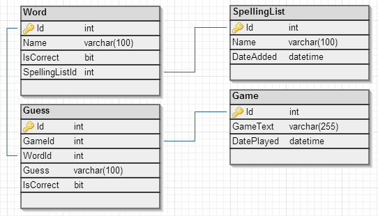


Now that we know what we want, let's take another look at ToDoDataContext.cs. As you can see, we have a constructor that passes the connection string to the DataContext super class. We want to replicate this for SpellingDataContext:


Now we are going to define our tables, we can do this in the same way as ToDoDataContext. The [Table] statement basically specifies that the following code pertains to a table. The use of square brackets before a block of code denotes an attribute in C#. You can also see these before the public properties which have the attribute defining a column before them. The column attribute for ToDoItemId has parameters, the parameters which can be passed in and their meaning are defined on the Microsoft page on attribute-based mapping. That page also has information on the parameters which can be present when defining an association. An association in the case of our Spelling Bee app would be a foreign key constraint e.g. the one that associates a word with a spelling list.

Once all your tables, columns and associations are defined you must add a reference to the tables from your DataContext object, e.g. public Table<Word> Words; After this we can move onto defining our ViewModel. An example of defining a table is as follows:


    [Table]
    public class Word {
        private int _id;

        [Column(IsPrimaryKey = true, IsDbGenerated = true, 
         DbType = "INT NOT NULL Identity", CanBeNull = false,
         AutoSync = AutoSync.OnInsert)]
        public int Id
        {
            get { return _id; }
            set
            {
                if (_id != value)
                {
                    _id = value;
                }
            }
        }

        private string _name;

        [Column]
        public string Name
        {
            get { return _name; }
            set
            {
                if (_name != value)
                {
                    _name = value;
                }
            }
        }

        private bool _isCorrect;

        [Column]
        public bool IsCorrect
        {
            get { return _isCorrect; }
            set
            {
                if (_isCorrect != value)
                {
                    _isCorrect = value;
                }
            }
        }

        [Column]
        internal int _spellingListId;

        private EntityRef _spellingList;
        [Association(Storage = "_spellingList", 
         ThisKey = "_spellingListId", OtherKey = "Id", 
         IsForeignKey = true)]
        public SpellingList SpellingList
        {
            get { return _spellingList.Entity; }
            set
            {
                _spellingList.Entity = value;

                if (value != null)
                {
                    _spellingListId = value.Id;
                }
            }
        }
    }


ViewModel/ToDoViewModel.cs

Now for the ToDoViewModel, this is where we handle events relating to data and what we use to get data! First we created a ViewModel folder and a SpellingBeeViewModel C# file. Then we took a look at the ToDoViewModel, this has a private field toDoDB of the ToDoDataContext type which unsurprisingly provides a reference to the database we just specified. The toDoDB is initialised in the constructor. We did the same for our spelling database in our SpellingViewModel class, to arrive at something like this:


Next, we looked at the data available through the ToDoViewModel. It defined a private field and property for all the data required by the MainPage and NewPage, so we did the same for our SpellingViewModel. We decided we needed the following data:
  • A collection of games. This can be added to when a new game is started, and is used for displaying scores.
  • A collection of spelling lists. This can be added to from the menu bar and is used for selecting which spelling list you would like to try.
  • A collection of words you have currently spelled correctly. This will be displayed on the home page.
  • A collection of words you have currently spelling incorrectly. This will be displayed on the home page.
Therefore, we created corresponding private and public fields in our SpellingViewModel of type ObservationalCollection. ObservationalCollections were used to aid us in automatically updating the user interface. For example, if we bind a dropdown to a observational collection and it changes, the dropdown will automatically update to match the changes.


The above populates the properties we defined earlier. But what if we want our database to come pre-populated with defaults and where do we load the database from? The answer is from your App's C# code, for us it is App.xaml.cs.

App.xaml.cs

In the App constructor, we want to instantiate the SpellingDataContext and check if the database exists. If the database doesn't exist we want to create it and insert the initial values in it:


Once the data has been loaded, we want to create the view model which will be used throughout the app for populating views. Using the view model, we can then call our method which retrieves the data from the database and maps it to collections on the view model. Now you can store data easily on Windows Phone apps, and use it in whatever way you like. It's important to note you may encounter a few issues:
  • If you cannot create your database your attributes on your columns may be a potential cause, in particular we had issues with auto-generating values for an entry based on an expression.
  • Also as mentioned previously, if you have to add references for linq then you may have selected a universal app initially. In which case either SQLite will need to be used or you can manually switch to a Windows Phone Silverlight app. The decision between the two will depend on how much code you have written when you discover this problem.
Enjoy!

Wednesday, 25 June 2014

Adding Sound Effects with AndEngine

Recently, we've been hard at work on Alien Outlaw (our fastest growing game)! And we thought it was about time we brought it to another level by adding not only levels but sound too. But before you can add sound effects, you need sound effects... We used Bfxr to generate my sound effects. I then converted them to OGG using media.io. You don't need to use OGG but if you're interested in why it's a good option you can read about the differences between audio formats.

We're going to assume a basic knowledge of setting up an AndEngine activity. At some point we'll develop a full tutorial from start to finish but for now this is the best we can do. Also keep in mind that any ellipsis (...) mean that we omitted the details for brevity. First you will need to set in your onCreateEngineOptions that you will require sound using the following code:

EngineOptions options = new EngineOptions(...); options.getAudioOptions().setNeedsSound(true);

Next we need to specify the code for loading the sound, this should be placed in onCreateResources method as follows:

SoundFactory.setAssetBasePath("mfx/");
try {
this._explosionSound = SoundFactory.createSoundFromAsset(this.mEngine.getSoundManager(), this, "explosion.ogg");

} catch (final IOException e) {
Debug.e(e);

}


The first line specifies that out sound files are located in the "mfx" directory within the assets directory. Then within the try-catch statement we try to set our private field of type Sound (_explosionSound). If the file exists and is of the format expected then the Debug statement should never be executed.

Finally, wherever you want to play a sound you've loaded, you call .play() on the sound object. If you have any questions, just ask!

Top Tips for SVGs with AndEngine

Using SVGs to get a TextureRegion in AndEngine is surprisingly simple but there are a few tricks we picked up to maximise the quality of your game's graphics:
  1. Make sure you specify your target SDK and minimum SDK in your app's manifest. This ensures that Android can accurately get the host device's screen size. If you don't do this, graphics may be scaled down and then scaled back up resulting in pixelated images.
  2. Using your AndEngine camera's size, and the screen size of the host device, calculate a scale factor which you can use when creating your texture regions. This ensures they are optimally sized for the screen they are being displayed on.
  3. If you have texture bleeding, try setting the third parameter of your BlackPawnTextureAtlasBuilder to 1. This spaces the generated bitmaps out so that they don't interfere with each other.
  4. If you are noticing unwanted transparency between shapes in your SVG, ensure that the shapes are overlapping. This is important because if there is no overlap, this area may become slightly transparent in the process of converting it to a bitmap.
This is what we started with:


This was the final result:


If you have any other tips, please leave a comment!

Friday, 20 June 2014

Trip Wire Tries SVGs with AndEngine!

First up, big props to kenney.nl for his public domain graphics... They're great. If you don't know what an SVG is, it's a scalable vector graphic and they have the advantage of making your app look better on different screen resolutions. But they come with the trade-off of slightly more loading time.

Today, I'm going to be experimenting with adding SVGs to Alien Outlaw! I'll be using AndEngine, as this is what I used to develop Alien Outlaw and Intellij because I prefer it over Eclipse. The first step is to download the AndEngine source code, it may take some tinkering to get it to work so don't be put off if it doesn't work straight away... It will save you time in the long run! You will also need the AndEngineSVGTextureRegionExtension.

I'm going to assume prior knowledge of how to code an Activity for AndEngine and skip straight to the setup, because this is the part I always struggle with:
  1. Go to File > Project Structure... (or ctrl + alt + shift + s)
  2. Add a module by clicking the green plus icon, which will bring up this dialog:
  3. Click content root and browse for the directory where you downloaded AndEngine and select it.
  4. Then click Finish
  5. Now you have a module, you need to look at its dependencies. Ensure that AndEngine has a dependency of Android 4.0 or higher as shown:
    Note this doesn't mean our game can't support lower versions.
  6. Next you need to add AndEngine as a dependency to your project module. Do this by clicking on the module (in our case Alien Outlaw), then the dependencies tab and then the green icon to add a module dependency.
  7. This will then need to be repeated to add AndEngineSVGTextureRegionExtension. Then you will need to add AndEngine as a module dependency on AndEngineSVGTextureRegionExtension.
  8. If you apply your changes, and view your Facets. They should look something like this:


If you look at the AndEngine github page you are able to download AndEngineExamples, one of these is SVGTextureRegionExample. The method onCreateResources shows you how to create a buildable bitmap texture atlas from several SVGs, and onCreateScene shows you how to use the SVGs you loaded. As a side note, I used a dictionary for mapping strings to a texture region as it was more logical to me. Have fun creating better quality games with SVGs!